PX or REM?
Which one should I use?
@Reader
Okay!
Let me give it a try …
@Reader
What Is The CSS
Clamp() Formula?
Clamp() Formula
clamp(minimum, preferred, maximum);
- Minimum: The smallest value the property can be.
- Preferred: The ideal value the property should be, often a relative unit like a percentage or viewport unit (e.g.,
vw,vh). - Maximum: The largest value the property can be.
Let’s say you want to set a font size on an h1 that scales with the viewport width but stays within a reasonable range. You might use:
font-size: clamp(2rem, 4vw, 3rem);
This means:
- At least 2REM (the minimum value).
- Ideally 4% of the viewport width (the preferred value).
- At most 3REM (the maximum value).
So, depending on the viewport width:
- If
4vwis less than 2REM, the value will be 2REM. - If
4vwis between 2REM and 3REM, the value will be 4vw. - If
4vwis more than 3REM, the value will be 3REM.
Moving to a More Complex Example:
Font Size Clamp()
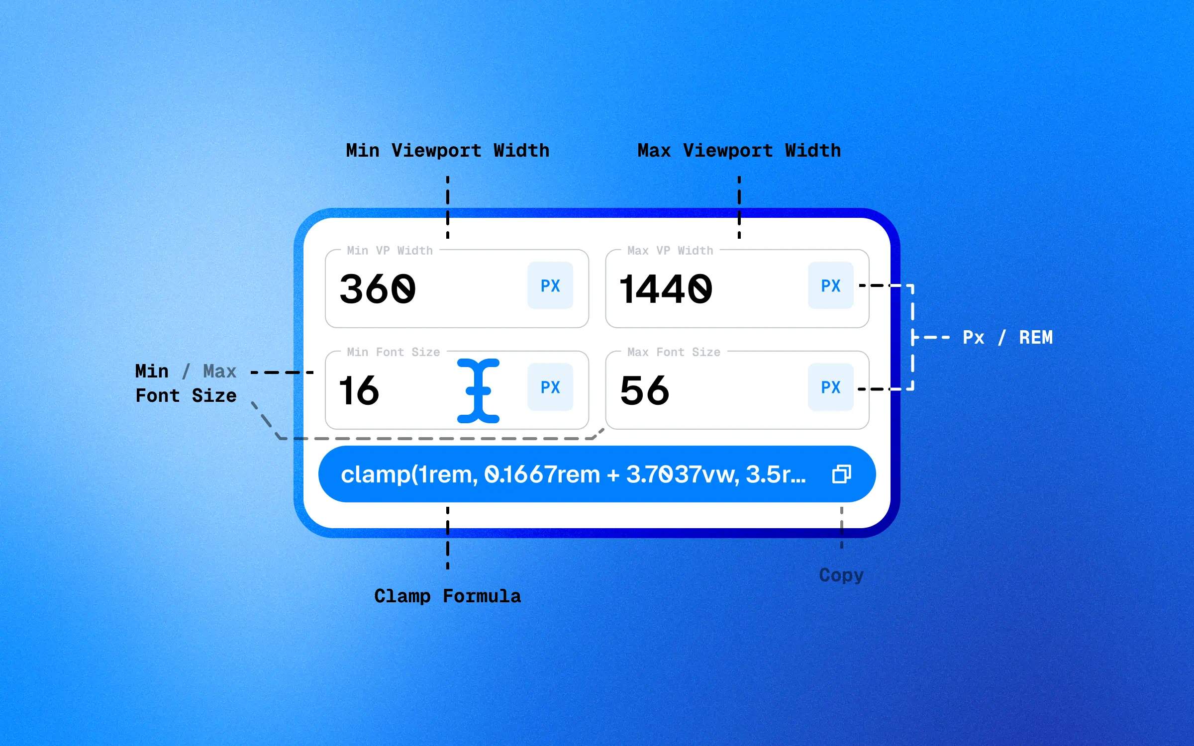
font-size: clamp(1rem, 0.1667rem + 3.7037vw, 3.5rem);
This clamp function sets the font size to:
- At least 1rem (the minimum value).
- Ideally a combination of 0.1667rem and 3.7037% of the viewport width (the preferred value).
- At most 3.5rem (the maximum value).
Clamp() On Other Things?
Yes, you can use the clamp() function for things other than font. Here is an example of how you could use the clamp() function to set the minimum and maximum height of a container:
.container {
height: clamp(200px, 50vh, 400px);}
Here is another example of how you could use the clamp() function to set the minimum and maximum duration of animation:.element {
animation: fade-in 2s ease-in-out;
animation-duration: clamp(1s, 50vw, 3s);}@keyframes fade-in { from { opacity: 0; }
to { opacity: 1; }}