Google Fonts is a library of free, open-source fonts that can be used for any web project. It offers a vast collection of typefaces, from traditional serifs and sans-serifs to modern display styles, making it easy to find the perfect font for your website or app. With Google Fonts, you can easily integrate custom typography into your website, without hosting the font files or paying for a font license. The fonts are optimized for web use and can be customized with various styles and weights to match your design needs. With its easy-to-use interface and a broad selection of fonts, Google Fonts is a valuable resource for web designers and developers looking to add a personal touch to their projects.
What Is The Best Google Font For A Website?
Google Fonts has become a go-to destination for designers and developers in search of a font that strikes the perfect balance between style and functionality. The real secret behind its popularity lies in its unwavering commitment to readability, versatility, compatibility, accessibility, performance, and of course, being free and open-source. According to BuiltWith Statistics, Google Fonts is used by more than 114 million websites, making it a popular choice for web designers and developers who are looking for free, high-quality font options.
To ensure that text displays correctly for all users, Google Fonts are optimized for web use and compatible with all modern browsers. Moreover, many of the fonts are designed with accessibility in mind, including support for screen readers and other assistive technologies. Furthermore, Google Fonts use efficient web font technology to deliver fast loading times, even on slower internet connections. All of this, along with the fact that all of the typefaces are completely free to use and do not need any licensing costs, makes Google Fonts a must-have tool for designers and developers everywhere. But not all fonts are created equal and some seem to outperform others in terms of usability and standardization.
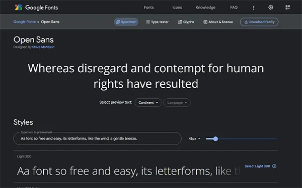
1. Open Sans
Open Sans, a creation of Steve Matteson, Type Director of Ascender Corp, is a humanist sans serif typeface with a unique blend of upright stress, open forms, and a neutral yet amicable appearance. Its 897 character set comprises the standard ISO Latin 1, Latin CE, Greek, and Cyrillic characters, ensuring it is versatile and accessible to a wide range of users. Designed for optimal use in print, web, and mobile interfaces, Open Sans boasts outstanding legibility in its letterforms. This is probably the most used Google Font out there.
Feel: Friendly
In March 2021, Open Sans underwent a transformation, becoming a variable font family that now includes Hebrew, as well as unifying and simplifying its licensing under OFL. For those in search of a font that is both readable and exudes a friendly, approachable demeanor, Open Sans is the ideal choice. Its versatility and accessibility make it a font fit for websites of all varieties, from tech-savvy to humanist in nature.
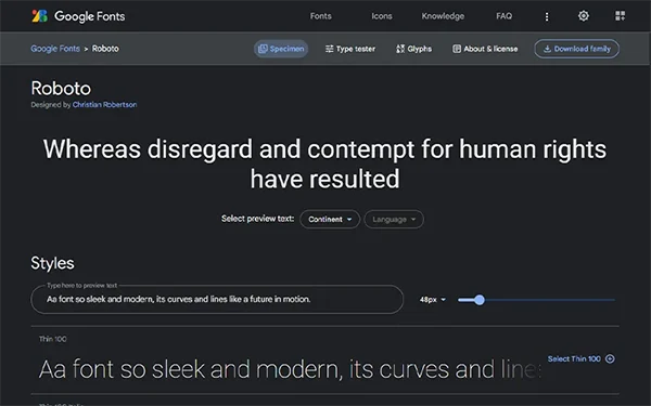
2. Roboto
Designed by Christian Robertson for Google, Roboto is a modern and tech-savvy sans-serif typeface. Released in 2011, Roboto is the default font for the Android operating system, known for its balanced character spacing and neat, geometric design. Optimized for high-resolution displays, Roboto’s readability makes it a popular choice for digital screens, both in small and large sizes.
Feel: Technology
Websites seeking a cutting-edge aesthetic should consider Roboto. Its balanced combination of mechanical structure and friendly curves make it ideal for technology and design-focused websites, as well as for mobile app interfaces. In the words of a famous book writer, Roboto represents the harmonious union of precision and approachability, a font fit for the technological age.
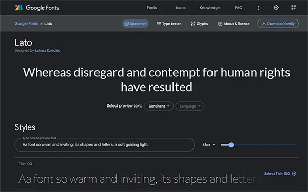
3. Lato
Lato, designed by Łukasz Dziedzic, is a versatile sans-serif typeface with rounded lines and a friendly feel. Originally created as a set of corporate fonts for a large client, Lato was eventually published under the Open Font License by the foundry tyPoland in 2010, with support from Google.
Feel: Architectural
With its neutral appearance, balanced classical proportions, and sleek, modern look, Lato is ideal for personal or corporate websites, online publications, and mobile apps. Its legibility and versatility make it a popular choice for designers and developers, and its availability on Google Fonts allows for effortless integration into web projects. Łukasz describes Lato as “male and female, serious but friendly, with the feeling of summer.”
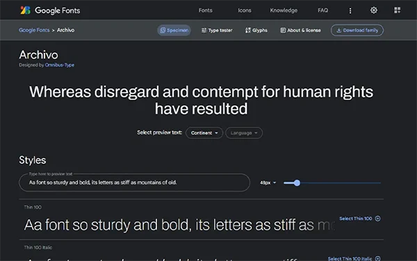
4. Archivo
Designed by Héctor Gatti and Omnibus-Type Team, Archivo is a sophisticated sans-serif font that embodies both technical and aesthetic excellence. With its roots in late nineteenth-century American typefaces, Archivo offers a modern and functional design with condensed letterforms, making it a popular choice for use on websites, apps, and digital products. The font was initially released in 2012, with a range of weights to cater to versatility in design and optimized for web use.
Feel: Modern
Websites in search of a sleek, functional font should turn to Archivo. Its condensed form and clean lines are ideal for small spaces, lending an air of sophistication to any digital project. Whether for corporate, tech, or creative websites, Archivo provides a unique aesthetic that brings a touch of modernity to any design. As a variable font with weight and width axes, it offers a wide range of styles and supports over 200 world languages, making it a versatile tool for typography.
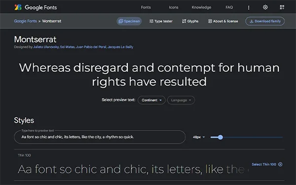
5. Montserrat
Montserrat, a font inspired by the traditional urban typography in the Montserrat neighborhood of Buenos Aires, was created by Julieta Ulanovsky to preserve the beauty of the past and rescue its essence. The font features a unique style, with letters possessing work, dedication, care, color, contrast, light, and life that make the city so beautiful. Released under the SIL Open Font License, the Montserrat font has two sister families, Alternates and Subrayada. The Regular family was redrawn and refined by Jacques Le Bailly, and the full set of weights was adjusted to make it lighter and better for use in longer texts. Julieta Ulanovsky and her team also developed Cyrillic support.
Feel: Creative
This font is ideal for websites that aim to evoke a traditional, vintage look. Its unique letterforms and rich history make it a perfect choice for blogs, book covers, and other types of content that aim to capture the essence of the past. Imagine, if you will, a book that tells the story of a city, its people, and its rich history. This is the kind of story that Montserrat, with its beautiful and timeless typography, would be perfect for
6. Playfair Display
Playfair Display is a transitional typeface designed by Claus Eggers Sørensen, a type designer based in Amsterdam. The design draws inspiration from the works of John Baskerville and “Scotch Roman” designs from the European Enlightenment. Ideal for display use, Playfair is optimized for high readability at larger sizes and boasts a range of elegant styles and weights.
Feel: Sophistication
Websites looking to add a touch of complexity and refinement to their typography should consider Playfair Display. Its distinctive transitional serif design is perfect for headings and titles, making it ideal for high-end fashion, luxury, and literary websites. As a well-versed book writer might put it, Playfair Display brings a sense of grandeur to any digital project, imparting a touch of class to every letter.
7. Poppins
Poppins, the internationalist geometric sans serif typeface, designed to support both Devanagari and Latin writing systems, was created with a focus on pure geometry, particularly circles. With nearly monolinear letterforms and optical corrections, the font maintains a balanced typographic color.
Feel: Unmistakable
This font is suitable for websites that value simplicity and clean design, such as tech or education-focused websites. As an expert typographer would say, “Poppins bears the mark of a new age, reflecting our technological advancement through its geometric shapes and balanced design, fitting for any modern online platform.”
8. Bitter
Bitter designed by Sol Matas is a contemporary slab serif typeface crafted for on-screen reading comfort. Its rational, pixel-inspired design boasts large x-heights and legible characters with a subtle rhythmic flow. With its balanced curves, minimal stroke weight variation, and manually spaced kerning, Bitter offers a dense and vivid reading experience.
Feel: Blog
This typeface is best suited for websites that prioritize readability and modernity. It’s perfect for electronic books, blogs, or any online content that requires a touch of sophistication. Bitter’s unique design and refined details make it a typeface fit for the digital age, an ode to the pixel by a designer who loves it.
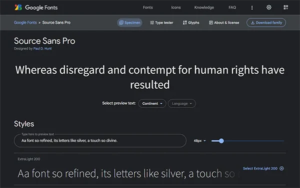
9. Source Sans Pro
Source Sans Pro, designed by Paul D. Hunt and released by Adobe in 2012, is a versatile sans-serif font optimized for digital use. With its clean, modern design and high legibility for body text, it is inspired by American Type Founders’ gothic but with a larger x-height and character width, and humanist-influenced italic forms.
Feel: Simplicity
Websites seeking refinement and clarity should consider Source Sans Pro. Its modern design and wide language support make it ideal for professional or corporate websites, online publications, and mobile apps. Whether used for headings or body copy, the font’s sophistication and consistency will bring a touch of sophistication to any digital project.
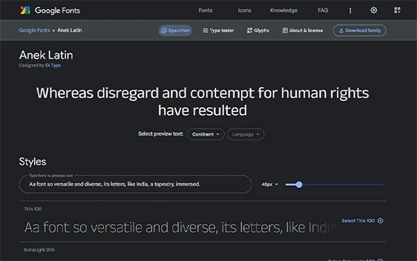
10. Anek
Anek is a versatile sans-serif font designed by Ek Type, a collective of type designers based in Mumbai. The font features geometric shapes and clean lines optimized for digital use and is available in 10 scripts with multiple weights and styles.
Feel: Multi-Script
This font is ideal for websites seeking a modern and sleek design. Its versatility and multiple personalities, from compact capsular forms to bold weights, make it suitable for use in headers, subheadings, and body text. Its application can range from technology and design-focused websites to fashion and creative projects.
Should You Use Google Fonts For Your Website?
Yes — we recommend you use Google Fonts. This is actually one of the best practices when building out your site. Google Fonts offer several advantages for website design. The fonts in the library are covered by open licenses, making them free for commercial use. They are also easy to add to your site and offer a wide selection, with new fonts regularly added. The fonts themselves are updated automatically and support multiple languages. Additionally, using Google Fonts reduces strain on servers, and offers a helpful interface for choosing the right typeface.
Google Fonts undergo testing to ensure that they display correctly across different platforms and devices. The company uses a high-speed content delivery network (CDN) to help prevent cross-platform issues and ensure that all major browsers can support the fonts. Additionally, the fonts are tested on a range of mobile devices to ensure they function properly and do not distort the text. Incorporating Google Fonts into your website can improve consistency and compatibility, as well as save costs.
What Is The Most Popular Website Font?
The Most Popular/Most Used Website Font is Roboto featured on more than 580,000,000 websites.
The Second Most Used Google Font is Open Sans featured on more than 80,000,000 websites.
The Third Most Used Google Font is Lato featured on more than 24,000,000 websites.
Which Font Is Most Pleasing To The Eye?
Totally subjective question but instead of giving you a “depends” Here are Some popular “attractive” font choices that are generally perceived to be easy on the eyes:
Georgia
Proxima Nova
Garamond
Open Sans
Lato
Does A Website Font Affect Seo?
No — the font used on a website does not DIRECTLY affect its SEO. However, the font can impact the user experience, which can indirectly affect SEO. For example, if the font makes the website difficult to read or navigate, visitors are likely to leave quickly, which can increase the bounce rate and decrease dwell time. Both of these metrics are taken into account by search engines when ranking websites, so a poor font choice can indirectly impact SEO.
To be clear, the font size and color you use on your website might have an indirect influence on its SEO since they affect user readability. Colors with high contrast and clear, legible text size are essential for ensuring people can quickly locate and interact with your site. Avoid misleading methods such as burying text in the same color as the background, as search engines may punish you for this. Focusing on readability and overall user experience is more crucial. Finally, the most crucial element is to select a typeface that is appropriate for your site and appealing to both you and your users.
What Fonts Do Popular Websites Use?
Google: Roboto
Amazon: Amazon Ember
Facebook: Helvetica Neue
Microsoft: Segoe UI
Apple: San Francisco
Tesla: Gotham SSm
Shopify: Shopify Sans
Wikipedia: Linux Libertine
Twitter: TwitterChirp
Airbnb: Circular
Netflix: Netflix Sans
Dropbox: Atlas Grotesk
Notion: Segoe UI
Walmart: Bogle
What Is The Best Font Size For A Website?
For Body Text: Minimum 16px (1 REM), Optimal 18px (1.125 REM), and Recommended 20px (1.25 REM).
The default text size in browsers is 16px. 1em = 16px.
When it comes to headings there is no one size fits all model. A good strategy could be to use a set defined difference (Usually 6 Pxs) between each step of fonts you set as headings. For example here is a commonly used set of heading sizes:
H1: 36-48 px — H2: 30-36 px — H3: 24-30 px
H4: 20-24 px — H5: 18-20 px — H6: 14-18 px
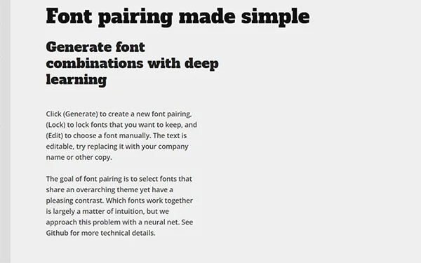
What Are The Best Google Font Combinations?
If you want inspiration on Font Pairing, please check out FontJoy, but here is one of the most beautiful combinations of Google Fonts that just make sense:
1. Crimson Text + Poppins
2. Montserrat And Oswald
3. Alfa Slab One + Open Sans
4. Ralewaylight + Source Sans Regular
5. Bitter Black + Roboto Regular
6. Noto Sans + Lora Regular Font
How To Optimize Google Fonts On Wordpress
The best way to Optimize Google Fonts on WordPress is to Preload the Font files instead of Using Google’s API to fetch the font. Host the web font files on your WordPress website’s server instead of relying on a third-party server to ensure faster loading times. This is very simple if you’re using Elementor Page Builder, simply go to Elementor > Custom Font. And add your TTF files. Done.
If you’re not using Elementor or any other Website Builder, Simply download the font family and then upload it to your content/uploads folder through FTP. To utilize them, do not include a reference to the third-party font host in the head> section of your pages. In your CSS, instead, mention your URL/fonts/FONT FILE NAME.file-extension. If you’re uncomfortable touching code there are WordPress plugins like OMGF | Host Google Fonts Locally that make this process easier and provides additional optimizations, so you can have the best of both worlds: visually appealing text and a fast-loading website. You can also further optimize by reducing the number of font families and weights, and preloading the fonts using pre-connect and preload links.
Best Practices For Using Google Fonts On Your Website
Choose font styles and weights carefully: Limiting the number of font styles and weights you use can reduce the number of requests and speed up the loading time.
Use WOFF2 format: The WOFF2 format is the most efficient format for web fonts, as it compresses the data better and loads faster.
Use Subsetting: By including only the characters you need in your font files, you can further reduce their size and speed up loading times.
Minimize HTTP Requests: Combine Google Fonts with other resources to reduce the number of requests to the server.
Use the “font-display” property: Use the “font-display: swap” property to specify how the font should be displayed if it is not yet loaded. This helps to prevent the flash of unstyled text (FOUT).
Use Preconnect and Preload: Preconnecting and preloading the font resource can help to reduce the delay in displaying the font on your website.
Use Browser Caching: Enable browser caching for your fonts by setting an appropriate cache-control header in your HTTP response.
Consider Hosting Locally: If you have frequent visitors from a specific region, hosting your font files locally can result in faster loading times for those visitors.
What Are The Different Types Of Fonts?
Here are the different types of Fonts out there:
Serif fonts: Characters with short strokes or lines at the ends are easier to read in print and other conventional media. Oldest and timeless fonts that are most likely to remain in use.
Sans-serif fonts: sometimes known as “slab,” are serif fonts that resemble serif typefaces but have stronger, block-like serifs, which makes them perfect for usage in titles and headers.
Display fonts: perfect for headings and titles because they are frequently more attractive and designed to be used in greater sizes. They are usually seen as unsuitable for the clarity needed for body copy.
Script fonts:they closely resemble handwriting and calligraphy, making them ideal for invitations, cards, and other official documents. Its composition is a little more informal, and it is embellished with many flourishes.
Monospace fonts: are suitable for coding, computer output, and typewriter-style text because they all have the same width. In essence, you could simply draw a rectangle box around each character, keeping the spacing constant.
Slab serif fonts: or simply “slab,” are serif fonts with larger, block-like serifs that are similar to serif fonts and are best used in headings and titles. Low-contrast strokes typically have serifs that match the entire stroke.
Frequently Asked Questions
What Google Fonts Are Safe And Most Timeless?
Arial is a Timeless Font, but it’s not a google font. A good replace meant of the Arial font is the Arimo font which is found in Google Fonts. Google Fonts has a variety of font styles that can be considered “safe” and “timeless”. Some of these fonts include:
Roboto: sans-serif typeface recognized for its uncluttered, uncluttered style.
Open Sans: neutral design that works well for both body text and headings.
Lato: rounded edges that provide a friendly feel to any website.
Montserrat: well-suited for headlines and logos.
Merriweather: easy to read in both digital and print media.
Due to their straightforward, clean designs that are simple to read and do not quickly go out of style, these typefaces are regarded as secure and timeless. They are also one of the most used fonts. They are a wonderful option for any website searching for a dependable, traditional typeface because they are commonly utilized and well-liked.
Can I Use Fonts From Google Fonts In Commercial Projects?
Yes — you can use fonts from Google Fonts in commercial projects. All fonts available on Google Fonts are open-source and free to use for any purpose, including commercial projects. You don’t need to pay a license fee or sign any agreement to use them. However, it is important to read and understand the specific license of each font before using it, as some may have certain restrictions or requirements for commercial use.
How Many Fonts Should You Use On A Website?
To make a website straightforward and aesthetically pleasing, it is advised to employ no more than two or three font families. Actually, we advise sticking with one, but if you must you can’t go wrong with two (three being the max). This will also cut down on the number of font files that must be downloaded, which can enhance website performance. The user experience may be harmed by an excessive number of fonts. For readability and accessibility, it’s crucial to take font consistency and contrast into account.
What Was Steve Jobs’s Favourite Font?
Steve Jobs was known to have a preference for the Helvetica font.
What Google Font Did Luxury Brands Use?
Luxury brands use a variety of font types, including both serif and sans-serif fonts. Some commonly used Best Google Fonts by luxury brands include Italiana, Luxurious Script, Oswald, and Crimson Pro.